Chat with an Agent
Chat with an agent using CopilotKit's UI components.
What is this?
Agentic chat UIs are ways for your users to interact with your agent. CopilotKit provides a variety of different components to choose from, each with their own unique use cases.
If you've gone through the getting started guide you already have an agentic chat UI setup! Nothing else is needed to get started.
When should I use this?
CopilotKit provides a variety of different batteries-included components to choose from to create agent native applications. They scale from simple chat UIs to completely custom applications.
CopilotPopup is a convenience wrapper for CopilotChat that lives at the same level as your main content in the view hierarchy. It provides a floating chat interface that can be toggled on and off.
import { CopilotPopup } from "@copilotkit/react-ui";

export function YourApp() {
  return (
    <>
      <YourMainContent />
      <CopilotPopup
        instructions={"You are assisting the user as best as you can. Answer in the best way possible given the data you have."}
        labels={{
          title: "Popup Assistant",
          initial: "Need any help?",
        }}
      />
    </>
  );
}
CopilotSidebar is a convenience wrapper for CopilotChat that wraps your main content in the view hierarchy. It provides a collapsible and expandable sidebar chat interface.
import { CopilotSidebar } from "@copilotkit/react-ui";
export function YourApp() {
return (
<CopilotSidebar
defaultOpen={true}
instructions={"You are assisting the user as best as you can. Answer in the best way possible given the data you have."}
labels={{
title: "Sidebar Assistant",
initial: "How can I help you today?",
}}
>
<YourMainContent />
</CopilotSidebar>
);
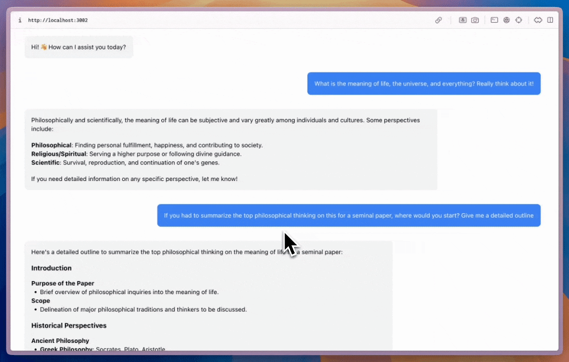
}CopilotChat is a flexible chat interface component that can be placed anywhere in your app and can be resized as you desire.
import { CopilotChat } from "@copilotkit/react-ui";

export function YourComponent() {
  return (
    <CopilotChat
      instructions={"You are assisting the user as best as you can. Answer in the best way possible given the data you have."}
      labels={{
        title: "Your Assistant",
        initial: "Hi! 👋 How can I assist you today?",
      }}
    />
  );
}
The built-in Copilot UI can be customized in many ways -- both through css and by passing in custom sub-components.
CopilotKit also offers fully custom headless UI, through the useCopilotChat hook. Everything built with the built-in UI (and more) can be implemented with the headless UI, providing deep customizability.
import { useCopilotChat } from "@copilotkit/react-core";
import { Role, TextMessage } from "@copilotkit/runtime-client-gql";

export function CustomChatInterface() {
  const {
    visibleMessages,
    appendMessage,
    setMessages,
    deleteMessage,
    reloadMessages,
    stopGeneration,
    isLoading,
  } = useCopilotChat();

  const sendMessage = (content: string) => {
    appendMessage(new TextMessage({ content, role: Role.User }));
  };

  return (
    <div>
      {/* Implement your custom chat UI here */}
    </div>
  );
}
Give it a try!
This video shows the result of npx copilotkit@latest init with the implementation section applied to it!
