Chat with an Agent
Chat with your Agent Spec agent using CopilotKit's UI components.
What is this?
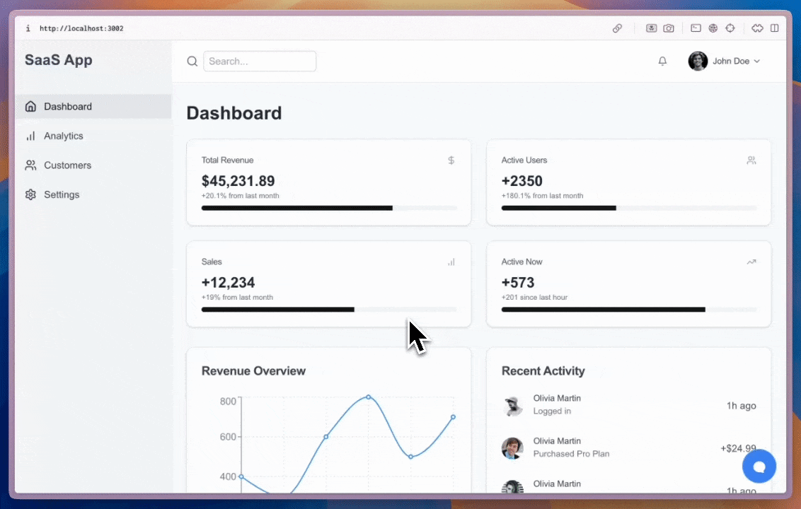
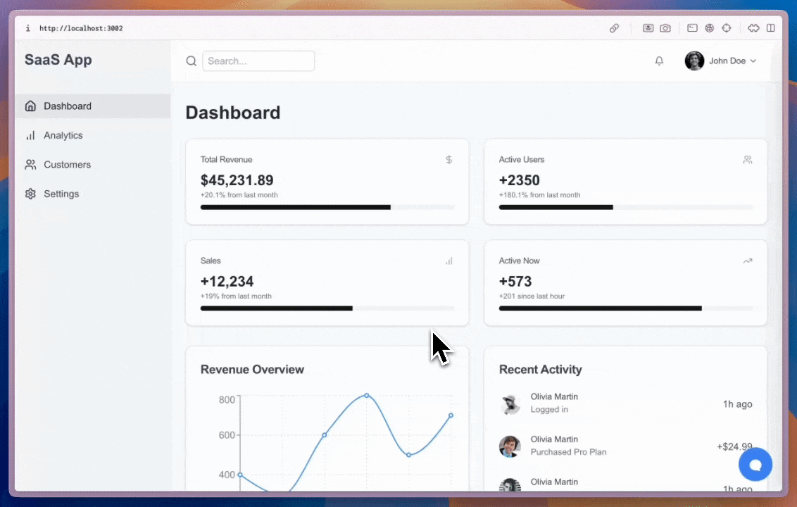
Agentic chat UIs let your users interact with your agent. CopilotKit provides prebuilt components (like CopilotChat and CopilotSidebar) as well as headless hooks — you can start simple and grow to a fully custom app.
If you've gone through the quickstart, you already have an agentic chat UI set up — nothing else is required to begin chatting.
When should I use this?
Use the agentic chat UI when you want a turnkey chat experience that:
- streams assistant text and tool calls/results,
- supports stateful conversations (thread/run lifecycle),
- can evolve into generative UI with custom renders.
CopilotPopup is a convenience wrapper for CopilotChat that lives at the same level as your main content in the view hierarchy. It provides a floating chat interface that can be toggled on and off.
import { CopilotPopup } from "@copilotkit/react-ui";

export function YourApp() {
  return (
    <>
      <YourMainContent />
      <CopilotPopup
        instructions={"You are assisting the user as best as you can. Answer in the best way possible given the data you have."}
        labels={{
          title: "Popup Assistant",
          initial: "Need any help?",
        }}
      />
    </>
  );
}
CopilotSidebar is a convenience wrapper for CopilotChat that wraps your main content in the view hierarchy. It provides a collapsible and expandable sidebar chat interface.
import { CopilotSidebar } from "@copilotkit/react-ui";
export function YourApp() {
return (
<CopilotSidebar
defaultOpen={true}
instructions={"You are assisting the user as best as you can. Answer in the best way possible given the data you have."}
labels={{
title: "Sidebar Assistant",
initial: "How can I help you today?",
}}
>
<YourMainContent />
</CopilotSidebar>
);
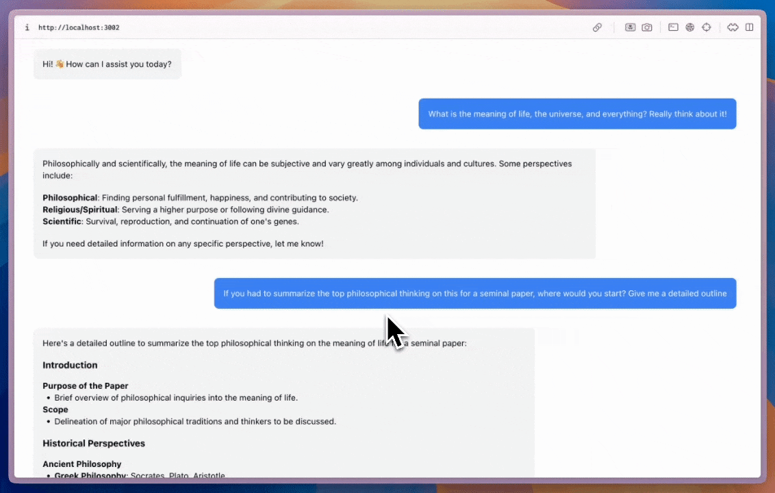
}CopilotChat is a flexible chat interface component that can be placed anywhere in your app and can be resized as you desire.
import { CopilotChat } from "@copilotkit/react-ui";

export function YourComponent() {
  return (
    <CopilotChat
      instructions={"You are assisting the user as best as you can. Answer in the best way possible given the data you have."}
      labels={{
        title: "Your Assistant",
        initial: "Hi! 👋 How can I assist you today?",
      }}
    />
  );
}
The built-in Copilot UI can be customized in many ways -- both through css and by passing in custom sub-components.
CopilotKit also offers fully custom headless UI, through the useCopilotChat hook. Everything built with the built-in UI (and more) can be implemented with the headless UI, providing deep customizability.
import { useCopilotChat } from "@copilotkit/react-core";
import { Role, TextMessage } from "@copilotkit/runtime-client-gql";

export function CustomChatInterface() {
  const {
    visibleMessages,
    appendMessage,
    setMessages,
    deleteMessage,
    reloadMessages,
    stopGeneration,
    isLoading,
  } = useCopilotChat();

  const sendMessage = (content: string) => {
    appendMessage(new TextMessage({ content, role: Role.User }));
  };

  return (
    <div>
      {/* Implement your custom chat UI here */}
    </div>
  );
}
Learn more
- Agent Spec docs home: https://oracle.github.io/agent-spec/development/docs_home.html
- Reference sheet (formats): https://oracle.github.io/agent-spec/development/misc/reference_sheet.html
